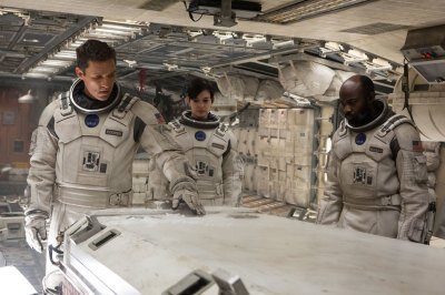
Case Study: Interstellar
This film was shot on film and finished on film.
“Seeing ‘2001’ on a big screen in 70mm is one of a handful of obligatory experience during a film lover’s lifetime. While this engagement may not be the last chance you will ever have, it could be; both 70mm and expensively restored prints are threatened in the new Hollywood, … If you have thoughtful children or teenagers, going to the movie with them may provide an experience they will remember all of their lives.”
Thursday 6th November 2014 I saw a preview of “Interstellar” from one of only five 70mm prints in Europe. This is how Christopher Nolan intended us to see his latest epic (much of it was shot on 65mm Imax film) and it turned out to be a really big deal.
With the 70mm presentations of Interstellar we have one more chance to savour such a memorable experience. It is likely that most of the current generation of cinema goers will never see film projection, so to see a modern example of film at its very best is probably on par with flying on Concorde. We will be telling the next generation that we watched films when they were shot and shown on film!
My first impression was that I had forgotten what film looks like. I am not talking about the cue dots, grain and sharpness (the invitation touted 9k resolution, surpassing even UHD at its best), I’m referring to the warmer color temperature, the gentle rolling off of the highlights and the deep rich shadow detail. I have to add that I forgot all these observations about 15 minutes into the movie, as I became engrossed in the engaging stories on screen.
Reviewers have inevitably compared it to Kubrics 2001: A Space Odyssey and less obviously to Homers Odyssey, and Carl Sagans Contact. The plot of Interstellar is more about time than space, and at many levels the film is more about art than science. The effects in Gravity where clever, but in Interstellar Nolan embraces our culture.
To choose film capture over digital today is similar to making a black and white movie in the age of color. Its powerful, but there has to be a reason for it. I can think of two. The first and arguably the most important is that it mirrors the IMAX films from footage shot by NASA in space. Even if you have never watched any of the films, chances are your perception of what its like to experience space and the stars are based on them. So making this film in the style of the reality footage makes perfect sense and enhances the credibility of what could have become implausible science fiction. Which brings us to the second reason; could we create that look with all the VFX and DI grading systems that we have today?
I am certain the answer is yes we could have matched the look, but therein lies the rub. What are we matching to? How do we know what it should look like? We can make informed decisions, and look at the NASA references but there will always be discussions and creative debate. This bought to my intention an interesting thought. The general approach to grading today is to make it look like “insert suggestion here”. The most popular instruction remains “make it look like film”. Nobody has ever asked me to make it look like Red, or Arri, or Sony (except when they want the GoPro shot to cut in to the rest of the narrative!) I admit that the current fashion for flat low saturated images is undoubtedly down to the influence of over exposure to log images, but personally that look does not hold my interest.
The beauty of shooting film, is that it is honest. It looks like what it is, discussion over. Of course we can tweak it and change it, but we can also print it and see what happens.
So I can recommend Interstellar as 3 hours of great entertainment, and also as one of those memorable events in a life-time. I am sure that the 35mm prints are close to the 70mm look, and I expect that the digital version will be close (though the colour space is different so it cant be quite the same). See 70mm if you can. A list of cinemas projecting film is half way down at http://www.in70mm.com/news/2014/interstellar/index.htm
Beyond that, I am curious to know what will come next.
Happy Coloring

