
“It is considered superfluous to study the laws of color, according to the saying ‘Draftsmen may be made, but colorists are born.’ Secrets of Color Theory? Why call those principles secrets which all artists must know and all should have been taught?”
We interpret color in three different ways:
Impression – our visual response
Expression – our emotional response
Construction – our cultural response
Effective use of color unites all three principles to create meaning.
Color Impression
Johannes Itten wrote, “Colors are the children of light”, which is a poetic way of saying that color is the response of the eye and brain to light. Objects do not have a color; it is the light reflected from it that generates color.

The Visible Spectrum
In 1613 the Jesuit Francois Aguilon declared that there were 3 colors that in combination with white and black could make all colors. Then in 1667 Sir Isaac Newton split a beam of light into its visible colors using a prism. Color understanding continued with research by Goethe, Runge and Maxwell that led to the theoretical models of Munsell and the French organization, CIE (International Commission on Illumination). A physicist describes color as wavelengths of light, and the human eye can see from about 400 millimicrons (violet) and 700 millimicrons (red). The CIE and Lab models are ways of describing all colors visible to the human eye and are device independent.
Colorists do not have such a wide palette to play with however, since the color space achievable depends on the reproduction device.
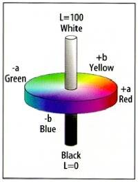
Lab Color
A magazine is printed with Cyan, Magenta, Yellow and Black (CMYK) inks so its color space is limited to colors that can be mixed from these inks. Film prints are assessed as Red, Green and Blue (RGB) values that refer to the three-color printer lights used to expose the emulsion. Computer workstations use digital RGB levels. Video on the other hand uses luminance and chrominance separation techniques that are useful in compression and image processing applications to encode images. These are the television transmission color spaces or transmission primaries.
(YIQ and YUV are analogue for NTSC and PAL, and YCbCr is digital) Transmission color space is not very intuitive and so telecine colorists often describe colors in terms of Hue, saturation and luminance (HSL).
CIE Color
CMYK, HSL, RGB, and YUV are all device dependent color spaces so a colorist must consider potential loss or distortion when going between systems. Colors will change when going from reality to a dye image on film, and again when in the electronic capture process. These changes are compensated with color correction. But the colorist must also consider the ultimate viewing medium and conditions, and these are emulated using lookup tables and hardware clips.

Background changes color perception. A gray circle appears lighter against black than against white.
Color space defines the available hues and shades, but the eye, unlike film and television, does not perceive color in a consistent way. The brain interprets color according to the "surround effect"Identical colors can be seen as different by changing the surrounding conditions – a useful tool when the color the client needs is outside of the available color space.

Green appears lighter and yellower against blue and darker and bluer against yellow.

The darker blue rectangle on the left is the exact same color saturation, hue and luminance, as the lighter blue rectangle on the right. These phenomena underline the importance of controlled ambient lighting in the telecine suite.
Chromatic adaptation is another surround effect: The longer we are exposed to a color, the less sensitive we become to it. Hence the need for reference stores, vector scopes, and waveform monitors. Without some absolute point of reference it would be a Herculean task to remain objective about color continuity for periods of eight hours or more. This persistence of vision is the reason that real-time color correction is absolutely necessary when making aesthetic decisions. Color matching is relatively easy, but making decisions that are still good the next day with fresh eyes are best done in real time. Our sensitivity to color over time affects the way we see adjacent scenes. However, we judge images against reality using color memory, that is, the way we expect something to look. Color memory is based on known realities such as skin, grass, and sky. Interestingly, research suggests that memory colors are different from physical colors. We generally prefer more cyan in the sky, and greener grass than is natural. Advertisers put a lot of effort in associating products with color memory, and some successful campaigns no longer have to show or even name the product once that memory has been established. Tobacco manufacturers in particular have found this to be a way around advertising restrictions.
The important lessons of color impression are that juxtaposition of color and contrast affect the perception of color. This is known as color effect.
There are harmonies and discords in color just as there are in music. Secondly, the various methods of producing or transmitting colors have different color space and do not support the same ranges of color. The colors of the original scene are altered when captured on film. Different systems display color in different ways. Televisions, film, data workstations, digital projectors, and plasma displays all reproduce colors differently. The Chroma Police are only mythical, but beware of illegal colors. What you see might not be what you get. Color History Through the ages philosophers and mystics, artists and scientists, photographers and hairdressers have all debated the nature of color and its use. For more than a thousand years, Indian astrologers have taught that sunlight is composed of all colors. In 1613 the Jesuit Francois Aguilon declared that there were 3 colors that in combination with white and black could make all colors. Then in 1667 Sir Isaac Newton split a beam of light into its visible color spectrum using a prism. That is probably the oldest technology used in a telecine.
However, the physical properties of color, known as color Impression, are the easiest to analyze. The psychological affects of color are more difficult to examine scientifically.
Color Expression
Since color is an interpretation of the human brain, it should come as no surprise that color can influence the brain. "Color Therapy", an alternative medicine treatment is growing in popularity and founded in some fact. Color expression is the term used to describe natural responses to color stimuli. These responses are generally universal.
RED triggers a response in the brain's adrenal cortex that temporarily stimulates adrenaline production. Adrenaline prepares the body for "fight or flight". Perhaps the brain associates red with blood and therefore injury. Consequently, being in a red room can make you irritable and exhausted. Red is used in fast food chains so that people do not stay too long.
YELLOW is thought to increase levels of melatonin, (used by the body to trigger relaxing sleep patterns) and causes a welcome, feel good effect. A yellow room has a sunny pleasing ambiance.
BLUE is calming, restful and safe.
DARK BLUE gives an impression of respectability and trustworthiness.
PURPLE is exciting probably because of the red content. It supposedly slows down the heart rate, hence an association with the transcendental.
GREEN is a soothing, refreshing color. We associate it with the peace and quiet of the countryside. Wearing it puts others at ease, and generates an aura of trust.
BLACK is an extreme, powerful and demanding color. It absorbs all frequencies of light and so makes a perfect background for other colors. Black provides an air of sophistication.
WHITE is interpreted as clean, pure, youthful, and expensive. No doubt this is a learned response based on experiences of keeping white items free from dirty marks. To be white it must be clean, which is interpreted as pure. These qualities are exactly those required for the safe care of babies, and so white is associated with youth.
Color Construction
Color construction on the other hand is a learned response to color that depends on culture. For example, Roman Catholic vestments are color-coded for different religious occasions and feasts. Colorists need to pay particular attention to these cultural influences because color construction can evoke very different responses in different people.
Skin color is a classic example. Preferences for skin tone range from pale and pink to warm and golden to dark and bronzed. Some explain the different aesthetics as an issue of economic status. Cultures that live or work outside prefer paler skin tones because only the wealthy can afford to stay inside. While for city types, expensive holidays in the sun are made apparent by returning with a suntan.
In China, white is the color of death and mourning signifying the path to purity and heaven. But in Judeo Christian societies of the West and Japan, white represents purity and innocence, and is associated with birth and marriage. For the Cherokee white is the color of peace and happiness.
Yellow is the most luminous color and was used by the Chinese as a symbol for wisdom and enlightenment. Only the emperor could wear yellow.
Green is considered by many to be an unlucky color in the house. This theory might have started in the 18th and 19th centuries when arsenic was an ingredient of green pigments. Green wallpaper gave off toxic vapors and might have prompted Oscar Wilde's famous last words "The wallpaper is terrible, one of us must go".
Color and Fashion
Understanding the three elements of color interpretation, Impression, Expression and Construction, does not quite complete the picture. Colors are subject to the influence of fashion too.
The British Textile Color Group (BCTG) meet twice a year to forecast (or determine) colors for fashion many seasons away. They form a consensus, which is compared with similar groups from all over the world. The fabric manufacturers adopt these colors, and display to designers who then incorporate the color palettes into their designs. The forecasters are consulted at every stage, and so their prophecies are eventually self-fulfilling.
This means that today's in vogue colors were actually determined as much as two years ago and have little spontaneity about them. A similar situation occurs in the telecine suite where a popular film, music video or advertising campaign will be imitated and embellished. Some experts state that color preferences change in cycles of 15 to 20 years. From chromatics, to darker earth tones, to lighter neutrals, then neutral and chromatics and back to chromatics. As colorists, we have all seen trends cycle repeatedly from bold "Technicolor" to pastels, to black and white, monochromes to duo tones and back to rich color again.
It is ironic that most people give color such little thought; yet it has such a profound affect. The same can be said of the role the colorist.
Happy Coloring!